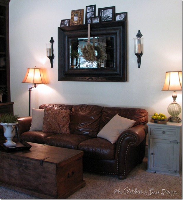
Sweet Rene over at Cottage and Vine is having her monthly Room to Room Party. I’m a little later for the party, but I thought this it would be fun to link up and a good time to share the progress in my family room.
I am trying to lighten it up a little and bring in some more color…it’s feeling a little too brown. I have removed all of the red that was there and am slowly adding in pops of color and some different textures.
Here is my design board I shared with you a few months back. So far I have put up the curtains, painted the end table, taken away & added accessories here and there, and have put out some temporary pillows to play around with. It is still a work in process, but coming along!
I am really happy with how it is coming together so far. It’s feeling very cozy, very comfortable, very warm and very me…that is what I want for my home. :)
If I can ever get a good picture of my curtains I will show you them in more detail….I love the fabric and what they add to the room. The light behind it is making it difficult. I need to read a tutorial on taking my camera off of auto;)
You can see a couple before shots HERE.
Thanks for taking a look!
Linking up….


I love the chest you are using as a coffee table!
ReplyDeleteYou can keep your camera on auto and still get the photo you want. If you want to take a picture of the curtains, put the curtains in the center of your viewfinder, press the button halfway down to set the focus and exposure, then move the camera to the side to frame the photo the way you want to see it. Your window will be overexposed, but your curtains should be perfect. It's digital, and pixels are cheap, so take lots of photos and experiment.
Your plan looks so pretty and calming Krista. That chunky old mirror - love it!
ReplyDeleteThanks for joining the "room to room" series.
-Rene
Looks so cozy and inviting!
ReplyDeleteI love your living room and the plan that you have. So cozy and inviting. Excited to see what you do with the built ins (they're gorgeous, by the way) :)
ReplyDeleteKrista this is a beautiful and welcoming room. I adore the deep neutral colors. Great job!
ReplyDeleteYour family room looks great. Like your use of a design board. I'm "stealing" that idea...I need it. Thanks. Wish I had your shelves on either side of your mantel. So many places to display found treasures or family photos, etc.
ReplyDelete